
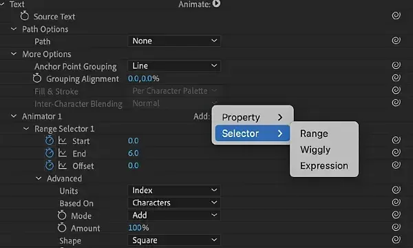
Text animators are After Effects controls that animate properties of individual characters, words or lines inside a single text layer. You add a property such as position or opacity, then use a range selector to decide which characters it affects, so one pair of keyframes can drive a smooth, staggered title animation.
Why It Matters
Kinetic typography, where words move, scale and fade in time with a voice or music, depends on animating many small pieces. Doing that with separate layers is slow and hard to change. Text animators keep everything in one editable text layer.
They are also the base of many animation presets and templates. Once you understand animators and selectors, you can customize presets, fix timing quickly and build titles that match your style.
Beginner Text Animators For Beginners
Create a text layer, open its properties in the timeline and click the Animate button next to the word Text. You choose a property, such as Position, Scale, Opacity or Rotation, and After Effects adds an Animator group with a Range Selector. The property values apply only to characters inside the selector range. Animate the range start or offset from 0 to 100 percent and the effect sweeps across the text one character at a time.
Key Parts Of An Animator
- The animated property, such as Position or Opacity, with a value to apply to selected characters.
- The Range Selector with Start, End and Offset, which decide where the effect lands.
- The Advanced section, which sets Based On (characters, words or lines), Shape and Smoothness.
- Keyframes on Offset or Start, which move the effect across the text over time.
- Multiple animators per layer, each with its own selector.
Common Animator Properties
| Property | Effect | Typical Use |
|---|---|---|
| Position | Moves each character from an offset | Letters sliding up into place |
| Opacity | Fades characters in or out | Soft reveal of words |
| Scale | Grows or shrinks characters | Pop-in and emphasis |
| Rotation | Spins characters | Playful or dynamic entrances |
| Tracking Amount | Changes the spacing of letters | Expanding or tightening text |
Build A Letter-By-Letter Reveal
- Create a text layer and type a short phrase.
- Click Animate, then Opacity, set Opacity to 0 percent and Position Y to 40 pixels using Animate again.
- Open the Range Selector and set Offset to -100 percent at the start of the clip, adding a keyframe.
- Move forward one second and set Offset to 100 percent, adding a second keyframe.
- Press the U key and preview, then adjust easing in the graph editor so the motion feels natural.
Common Mistakes
- Animating Start and End separately instead of using Offset, which makes timing harder to edit.
- Leaving the animation linear, so it looks mechanical instead of smooth.
- Setting Smoothness to 0 percent, which makes letters pop abruptly.
- Using too many properties at once so the text becomes hard to read.
A Worked Example
To bring in a headline, add an animator with Opacity at 0 percent and Position Y at 60 pixels. Set the Range Selector Based On to Words so each word reveals together, and keyframe Offset from -100 to 100 percent over 1.2 seconds. Add an ease at both keyframes. The headline rises into place word by word, and changing the text later does not break the animation.
Timing To Sound
Kinetic typography feels strong when words land on beats or syllables. Place markers on the timeline at important beats of the audio, then adjust keyframes to land there. Short words may need fast timing and long words more time. Changing the Based On setting between characters and words lets you control rhythm without rebuilding the animation from scratch.
Readable Type First
Beautiful motion is wasted if viewers cannot read the words. Keep text on screen long enough to read it at a comfortable pace, use a clear typeface with strong contrast against the background, and avoid animating tiny text. Test the result at the size where it will be watched, such as a phone screen, and simplify any move that makes reading harder.
Handy for this: Fast Wide-Angle Lens — gather more starlight. (affiliate link)
Advanced Selectors, Expressions And Reusable Structure
Range Selector Shapes And Smoothness
The Shape setting of the selector controls how the effect ramps in. Square gives a hard cutoff, Ramp Up gives a gradual fade across the text, and Triangle, Round and Smooth create peaks. Smoothness softens the edges between characters. Combining a Ramp Up shape with an Offset animation produces fluid cascades. Adjust these in tandem with the graph editor so the overall motion eases in and out.
Randomize And Wiggly Selectors
Add a Wiggly Selector to a property to randomize the effect across characters, giving scattered, organic motion. Randomize Order in the Advanced section shuffles which character is affected first. Setting the wiggle to a low correlation makes each character differ, and a higher correlation keeps neighbors similar. These tools give a hand-made feel with no extra keyframes.
Expressions For Text
Expressions let you link text properties to other layers or controls. A slider control can drive the Offset, so one number controls an entire sequence of titles. Basic ideas are covered in expressions basics. You can also use text expression selectors to animate based on character index, which lets patterns such as alternating up and down moves follow the order of the letters.
Presets, Precomps And Final Delivery
Animation presets save animators for reuse, and animation presets explains how to apply and customize them. Build title systems inside a precomp so a consistent look can be reused across a project. Add motion blur to fast moving letters for a smoother result, and consider lower thirds as a practical, frequent use of animated text.
Try It
- Create a text layer with a five-word phrase.
- Add an Opacity and Position animator and keyframe the Range Selector Offset.
- Switch the Based On setting from Characters to Words and compare.
- Add easing in the graph editor and turn on motion blur for the layer.
Common Questions
What is the difference between text animators and keyframing a text layer?
Keyframes on a layer move the whole text. Animators apply properties to selected parts of the text, so letters or words can animate one after another within a single layer.
Why does my text animation look stiff?
Most likely the keyframes are linear. Apply easy ease and adjust the curves, and increase Smoothness on the Range Selector.
Can I change the text after animating?
Yes. Because the animation depends on the selector and not on specific characters, you can edit the words and the animation still works.
Do text animators work with fonts and styles?
Yes. You can animate fill color, stroke, blur and many other properties along with position, scale and rotation.
Related Lessons
- Keyframes And Graph Editor for easing the motion of your animator.
- Expressions Basics to link animator values to sliders.
- Animation Presets to apply and customize ready-made text moves.
- Lower Thirds for a common practical use of animated text.
- Motion Blur In After Effects to smooth fast letter movement.
Gear That Helps With This
Hand-picked kit that makes this lesson easier to put into practice.
Some links are affiliate links: if you buy through them we may earn a small commission at no extra cost to you. How this works.