
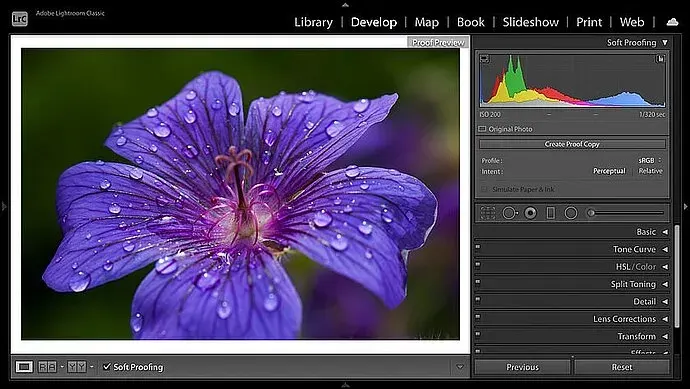
Soft proofing is a way to preview how a photo will look when printed by simulating the paper and printer profile on your monitor. It uses an ICC profile to show colors that the printer cannot reproduce, so you can adjust the image before wasting ink and paper on a print that looks different.
Why It Matters
A monitor emits light and a print reflects it, so the same file looks different in each. Prints are usually duller, with less contrast and a smaller range of colors, and saturated blues, greens and oranges can shift.
Soft proofing shows these differences while you edit. It reduces test prints, saves money and gives you confidence that a gallery or lab print will match your intent.
Beginner Soft Proofing Basics
Soft proofing needs three things: a calibrated monitor, an ICC profile for your printer and paper combination, and software that supports proofing, such as Lightroom or Photoshop. In Lightroom, turn on Soft Proofing in the Develop module, choose the profile, and the histogram shows the printer gamut. Photoshop uses View, Proof Setup, then Custom, where you choose the profile, rendering intent and black point compensation.
What You Need
- A monitor calibrated to a known white point and brightness, often 120 cd/m2.
- The ICC profile from the paper maker or your print lab.
- A viewing light that is consistent, ideally close to 5000 K.
- Software with a proof preview and gamut warning.
- A small test print to confirm the match.
Rendering Intents
| Intent | What It Does | Best For |
|---|---|---|
| Perceptual | Compresses all colors to fit the gamut, keeping relationships | Photos with highly saturated colors |
| Relative Colorimetric | Keeps in-gamut colors exact and clips out-of-gamut colors to the nearest match | Most photographic prints, usually with black point compensation |
| Saturation | Boosts saturation within the gamut | Graphics and charts, rarely photos |
| Absolute Colorimetric | Matches paper white as well | Specialized proofing work |
A Soft Proofing Workflow
- Calibrate the monitor and finish normal editing first.
- Enable soft proofing and select the printer and paper profile from your lab or paper maker.
- Switch on the gamut warning to see which colors are out of range.
- Create a proof copy and adjust saturation, contrast and brightness until the preview matches your intent.
- Print a test, compare it to the screen under good light and refine if needed.
Common Mistakes
- Skipping monitor calibration, so the preview is wrong from the start.
- Using a generic profile instead of one for the exact paper.
- Editing the master file to match the proof, which can damage the screen version.
- Judging the print under dim or warm light.
A Worked Example
A sunset photo shows deep orange and magenta on screen. With soft proofing on, the preview becomes duller and the gamut warning highlights the brightest orange sky. A proof copy is made with a small saturation reduction and a brightness lift of 0.3 stops. The print then shows a smooth gradient without banding, close to the intended mood.
Paper Choice Changes The Result
Glossy and luster papers hold deep blacks and saturated color, while matte papers produce softer contrast and a smaller gamut. Fine art papers often need extra contrast and brightness. Each paper has its own profile, so switching paper means switching proof settings, and the same file may need separate versions.
Brightness Matters
Prints often look darker than the monitor, because a bright screen may be twice as luminous as the light on a print. Calibrating the monitor to a lower brightness, or adjusting the proof brightness, gives a more realistic preview. Many prints look too dark simply because the screen was too bright when editing.
Preparing The Final Print File
After soft proofing, make a dedicated print copy, resize to the output size and apply output sharpening for the paper type. Matte paper usually needs a little more sharpening than glossy. Save the file with the lab or printer profile embedded if it is going to a print service, or let the printer driver manage color if you print at home, but never apply color management twice.
Printing At Home Versus At A Lab
Home printing gives control and quick tests, but requires profiles for each paper and ink set. A lab offers consistency and large formats, and often supplies profiles you can download for soft proofing. Ask the lab about preferred color space and file format. Either way, order a small test print before committing to a large or expensive piece.
Keeping Records
Write down the paper, profile, rendering intent and brightness settings used for each successful print. This makes repeat orders easy and helps you diagnose problems. A simple text note stored with the file is enough. Over time you will build a reliable recipe for the papers you use most.
Handy for this: Monitor Calibrator — colors you can trust. (affiliate link)
Advanced Profiles, Gamut And Managed Workflow
Color Spaces For Printing
Work in a wide space such as Adobe RGB or ProPhoto RGB while editing, and convert to the printer profile at the output stage. This keeps more color information before printing. The relationships are explained in color spaces compared and color gamut explained, and apply across a color managed workflow.
Monitor Calibration
Reliable soft proofing depends on an accurate display. Use a hardware colorimeter and recalibrate regularly, as discussed in monitor calibration. Keep ambient light stable so that perception does not change during the session. Without calibration, soft proofing may mislead you.
Paper And Output Choices
Different surfaces and weights change how a picture feels. See photo paper types for choosing between gloss, luster and matte, and Lightroom export for preparing files for labs and web. Lab-provided profiles are usually tuned for their machines, so use them for orders.
Gamut Warnings And Black Point
The gamut warning overlays out-of-range colors, usually in a bright shade, so you can reduce saturation locally. Black point compensation maps the darkest black of the source to the darkest black of the printer, which preserves shadow detail. Keeping it on is recommended for most photographic prints, and a test print confirms the result.
Try It
- Calibrate your monitor and enable soft proofing in your editor with a paper profile.
- Turn on the gamut warning and note which colors are flagged.
- Make a proof copy and adjust until the preview looks close to the original.
- Print a small test and compare it to the screen under good light.
Common Questions
Do I need soft proofing for lab prints?
It helps, especially for saturated images, but many labs accept sRGB and handle conversion. A lab profile gives the best preview if one is offered.
What rendering intent should I use?
Relative colorimetric with black point compensation is a good default for photos, and perceptual suits very saturated images.
Why does my print look darker than my screen?
The screen is usually too bright. Calibrate to a lower brightness and use soft proofing to preview it.
Can I soft proof without a calibrated monitor?
You can, but the preview may be inaccurate. Calibration is the foundation of reliable proofing.
Related Lessons
- Color Managed Workflow for the full chain from camera to print.
- Monitor Calibration to make your screen trustworthy.
- Photo Paper Types to choose a surface.
- Color Spaces Compared for editing and output spaces.
- Lightroom Export to deliver files for printing.
Gear That Helps With This
Hand-picked kit that makes this lesson easier to put into practice.
Some links are affiliate links: if you buy through them we may earn a small commission at no extra cost to you. How this works.