
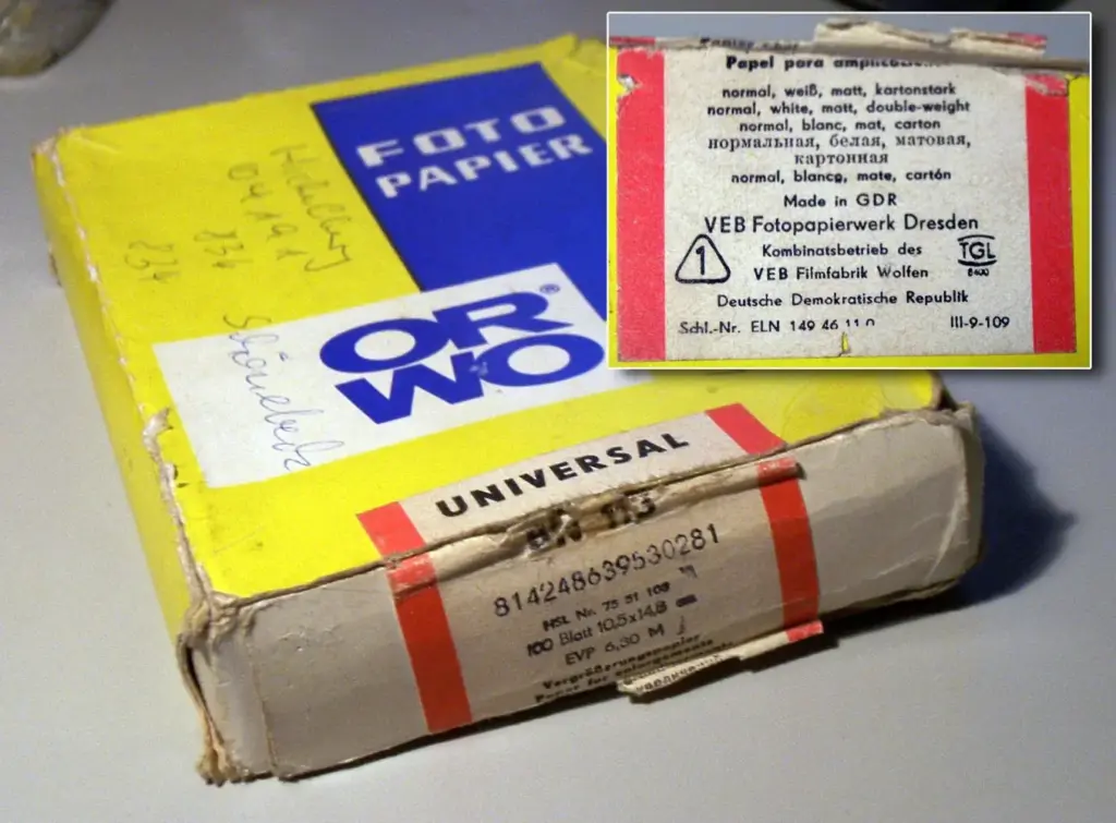
Photo paper types differ mainly in surface finish, weight and base material. Glossy and luster papers give strong color and deep blacks, matte and fine art papers reduce glare and suit soft or textured images, and baryta papers add a traditional darkroom feel. Choosing well depends on the image, the viewing light and the printer.
Why It Matters
The paper changes how a photograph looks as much as the editing does. Contrast, color range, texture and mood all shift when the same file is printed on different surfaces.
Understanding paper types also saves money. Test prints on the wrong paper waste ink and time, and a mismatch between image and finish can make a good photo look flat.
Beginner Photo Paper Types Explained
Paper is described by finish, weight and base. Finish is the surface: glossy, luster, satin, matte or textured. Weight, measured in grams per square meter, tells you how thick it is, with heavier papers feeling more substantial. The base can be resin-coated, a cotton rag, a baryta layer or alpha-cellulose, and it influences durability and look. Together these decide color gamut, black density and handling.
Common Finishes
- Glossy: highest contrast and saturation, but shows fingerprints and glare.
- Luster or satin: a slight texture, good color and less glare, popular for portraits and events.
- Matte: no glare, softer blacks, suits fine art and black and white.
- Baryta: smooth with a classic darkroom look and deep blacks.
- Textured fine art: cotton rag with visible texture for a painterly effect.
Choosing By Image
| Image Type | Good Choice | Reason |
|---|---|---|
| Vivid landscapes | Glossy or luster | Strong color and contrast |
| Portraits | Luster or satin | Flattering skin, less glare |
| Black and white | Baryta or matte fine art | Tonal depth and a refined look |
| Soft or moody images | Textured matte | Gentle contrast and texture |
| Prints in a bright room | Luster or matte | Less reflection |
Testing Paper Before A Big Run
- Choose a test image with shadows, highlights, skin tones and fine detail.
- Print the same file on two or three papers using the correct profile for each.
- Let the prints dry for a day, because the look changes slightly as ink settles.
- View them in the light where the final print will hang.
- Compare black density, color and texture, and note which paper suits the image best.
Common Mistakes
- Using the wrong paper profile, which gives muddy color.
- Judging a print immediately after it comes out of the printer.
- Choosing glossy for a room with strong windows and glare.
- Ignoring paper weight for large prints that need to stay flat.
A Worked Example
A dark moody forest photo looks flat on a plain luster paper, because the blacks never get deep. Printing on a baryta paper with a profile gives richer blacks and subtle texture, while a smooth matte paper makes it soft and quiet. After testing, you choose baryta for the main print and matte for a gift copy.
Weight And Feel
Weights from 190 to 320 grams per square meter are common. Lighter papers suit small prints and albums, while heavier ones feel premium and resist curling in frames. For large framed prints, choose a heavier paper and consider a mat to keep it flat.
Resin Coated Versus Fiber Based
Resin coated papers dry quickly and are easy to handle, which makes them common in labs and home printers. Fiber based papers, including baryta and cotton rag, have a more traditional appearance and a longer archival tradition, but take more care in handling and often cost more.
Whiteness And Brighteners
Papers contain optical brighteners, which make white appear brighter under UV light, but may yellow over time. Natural white papers have no brighteners and look warmer. Pick based on the image and the display setting, and ask for archival ratings if longevity matters.
Viewing Light
The same print looks different under daylight, warm bulbs and gallery spots. Evaluate under the light where it will be displayed. Glossy surfaces show reflections, while matte surfaces hold color evenly. If the light is mixed, choose luster or matte as safer options.
Handling And Storage
Handle prints by the edges with clean hands or cotton gloves. Store them flat in archival sleeves away from light, heat and humidity. For framed prints, use UV protective glass and acid-free mats. Good handling protects the print as much as the paper choice does.
Budget And Sample Packs
Fine art papers can be expensive, so buy sample packs before committing to boxes. Many makers sell packs with several surfaces in small sizes at a low price. Print the same test image on each, label the back with the paper name and keep them as a reference for future decisions about which finish suits which kind of image.
Choosing For Albums And Books
For albums and books, pick a paper that is flexible and does not crack at folds. Luster and satin finishes are common choices because they resist fingerprints and glare. If you work with a lab, ask for a sample of their available finishes and match the paper to the mood of the project and the way it will be handled.
Home Printer Versus Lab
Home printers give control and fast turnaround, while labs give scale, consistent color and a wide choice of papers. For important work, many photographers test at home and order final prints from a lab, or the reverse. Whichever you choose, use proper profiles and calibrated screens so that the result matches your expectation.
Handy for this: Monitor Calibrator — colors you can trust. (affiliate link)
Advanced Craft, Science And Color Management
Color Gamut And Black Density
Each paper has a different gamut and maximum black. Glossy and baryta papers usually reach deeper blacks, while matte papers have a smaller range but a distinct tone. Printer profiles describe these limits, and soft proofing lets you preview them on screen before printing.
Profiles And Color Management
Using the paper maker profile matters. Without it, colors and contrast shift. A calibrated screen and managed workflow, as explained in color managed workflow and monitor calibration, make prints match what you see. Always select the profile that matches both printer and paper.
Archival Properties
Longevity depends on ink, paper and storage. Cotton rag and alpha-cellulose papers without brighteners tend to resist yellowing. Pigment inks resist fading better than dye inks. Check manufacturer ratings, and avoid direct sunlight regardless of the paper type.
Matching Paper To Final Use
A print for a client meeting, a gallery wall or an album each has different needs. Think about glare, handling, budget and mood before buying a big batch. Order sample packs to compare papers directly, and keep notes on which ones worked for which images, so repeat jobs are quicker and more predictable.
Try It
- Pick one image with deep shadows and bright color.
- Print it on a glossy, a luster and a matte paper with the correct profiles.
- Let the prints dry for a day and view them in the display light.
- Write down which finish suits the image and why.
Common Questions
What is the difference between glossy and luster?
Glossy has a smooth shiny surface with the highest contrast, while luster has a slight texture that reduces glare and fingerprints.
Which paper is best for black and white?
Baryta and smooth matte fine art papers are popular for tonal depth and a refined look.
Do I need a paper profile?
Yes. A profile matched to your printer and paper gives accurate color and contrast.
Does paper weight matter?
Yes. Heavier paper feels better, resists curling and suits large framed prints.
Related Lessons
- Soft Proofing For Printing to preview a paper.
- Color Managed Workflow for accurate prints.
- Monitor Calibration so screens match prints.
- Low Key And High Key for choosing paper for tone.
- Texture In Photography for textured papers.
Gear That Helps With This
Hand-picked kit that makes this lesson easier to put into practice.
Some links are affiliate links: if you buy through them we may earn a small commission at no extra cost to you. How this works.