
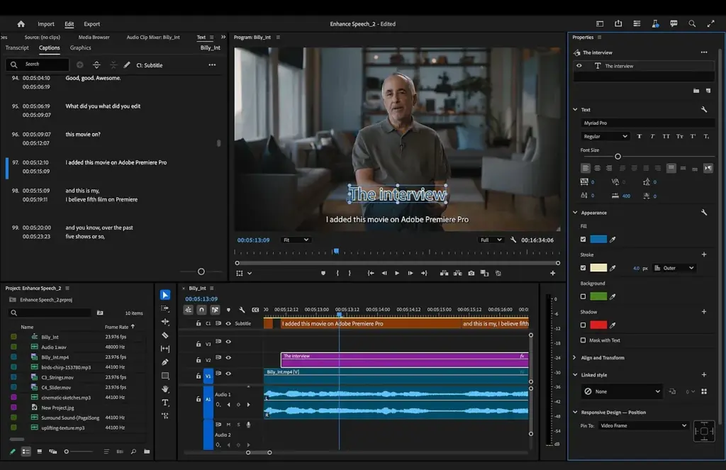
Essential Graphics is a panel in Premiere Pro for creating and editing titles, lower thirds and other graphics. You add text and shape layers, set fonts, colors and positions in the Edit tab, and save the result as a reusable motion graphics template with controls that you can change quickly for each project.
Why It Matters
Titles, names and captions give a video a finished, professional look. Without a good system, every graphic is built from scratch and drifts in style from one video to the next.
The Essential Graphics panel lets you design a graphic once, save it and reuse it, and it keeps text editable right on the timeline.
Beginner Essential Graphics For Beginners
Open the panel from the Window menu, or switch to the Graphics workspace. The Browse tab holds ready-made templates, and the Edit tab holds the layers and settings of the graphic you have selected.
Creating A Title
- Move the playhead where the title should appear.
- Choose the Type tool and click in the Program monitor, then type your text.
- Open the Edit tab, select the text layer and set the font, size and color.
- Use the Align and Transform section to center and position the text.
- Trim the graphic clip on the timeline to the length you want.
Building A Lower Third
A lower third usually shows a name and a title for a speaker. Create two text layers, add a rectangle shape behind them, and group them. Position the group near the lower left or lower right, and keep it inside the title safe area. Add a short fade in and out with the effect controls so it enters and leaves smoothly.
Key Settings
| Setting | Purpose |
|---|---|
| Font and size | Sets the look and readability |
| Fill, stroke and shadow | Adds contrast so text stays legible |
| Align and Transform | Positions layers precisely |
| Responsive Design | Keeps spacing when text or clip length changes |
| Master styles | Applies one look to many text layers |
Good Habits
- Use a clear, bold font that is easy to read on a phone.
- Keep text inside the safe margins so it is not cut off on some displays.
- Limit yourself to one or two fonts and a small color palette.
- Give text enough contrast with a shadow or a background bar.
- Keep titles on screen long enough to read twice.
Common Mistakes
- Placing text over busy detail without a background or shadow.
- Using too many effects and fonts in one title.
- Making a title too small for mobile viewing.
- Forgetting to save a finished graphic as a template.
Start With A Grid
Turn on the guides and the title safe margins so that you can align text consistently. Placing every lower third in the same position makes your videos look planned and tidy.
Handy for this: Fast Wide-Angle Lens — gather more starlight. (affiliate link)
Advanced Templates, Responsive Design And Repeatable Workflows
Responsive Design
In the Responsive Design Position section, you can pin layers to one another or to the frame, so a background box grows when the text gets longer. Set the text layer as the controlling layer and pin the box to it with some padding. Responsive Design Time lets you protect the intro and outro sections of an animated graphic, so that only the middle is stretched when you trim the clip. Together, these settings make a lower third that survives long names and different durations.
Master Styles
A master style is a saved set of text attributes that can be applied to any layer. Create styles for headline, subhead and caption, and when you change the master, all layers that use it update. This is the way to keep a series of videos consistent, and it is far easier than adjusting each title by hand.
Motion Graphics Templates
Right-click a graphic and choose export as motion graphics template to save it. You can choose which properties to expose as editable controls on the template, such as text, color and a slider. Others can then use it from the Browse tab without opening the layers. Templates made in After Effects can also be used in Premiere Pro, as discussed in After Effects lower thirds and linked through Dynamic Link.
Animation
Add simple animation with keyframes on position, opacity or scale in the effect controls, as covered in Premiere keyframes. For a smooth feel, use ease in and ease out on each keyframe. Avoid fast bouncing or spinning, which draws attention away from the content. Keep durations short, about half a second for entrances, so the graphic does not slow the pace.
Efficient Habits
- Build a small library of templates for titles, lower thirds, end cards and chapter cards.
- Store templates in a shared folder or library for a team.
- Use markers and the keyboard shortcuts listed in Premiere shortcuts to place graphics quickly.
- Place graphics on dedicated tracks so that you can find and move them easily.
- Duplicate a graphic and edit the text to keep the same look and timing.
Captions Versus Graphics
Captions use a different workflow, with the text tools described in Premiere captions. Use graphics for designed titles and captions for subtitles. The two can share fonts and colors so that the video feels consistent. For corrections of color on titles that look dull on export, check Lumetri color basics and apply grading below the graphics track.
Performance And Export
Complex graphics with many layers and effects can slow playback. Render the sections with graphics, as in Premiere render preview, and check the final export on a phone and a larger display. Look for text that is blurry or cut off, and fix it by adjusting size and placement. Confirm fonts are installed on every computer that opens the project, or that they are available through your cloud fonts, since a missing font will swap to a different one.
Over time, a clean set of templates turns title creation from a half hour task into one that takes a minute, and keeps every video recognizable as part of the same series.
Version Control For Templates
When you update a template, save it with a version number in the name, and keep the older one until you finish active projects. Mismatched versions can change the look of an ongoing series. Keep a short note listing which properties are exposed and what each does, so that other editors can use the template without guesswork.
Try It
- Create a new title in the Program monitor and style it with a bold font and a soft shadow.
- Build a lower third with two text lines and a rectangle, then group the layers.
- Turn on Responsive Design and pin the rectangle to the text with padding.
- Export the graphic as a motion graphics template and reuse it with a different name.
Common Questions
What is the difference between a title and a motion graphics template?
A title is a graphic in one project. A motion graphics template is a saved version with exposed controls, which can be reused in other projects.
Why is my text cut off on some screens?
It may be outside the safe margins. Keep important text inside the title safe area, especially on the sides.
Can I use fonts from my computer?
Yes, and also fonts from your cloud library when available. Make sure the fonts are installed on any computer that edits the project.
How do I change many titles at once?
Use master styles. Apply the same style to each text layer, then edit the master to change them all.
Related Lessons
- Premiere Keyframes for animating graphics.
- Premiere Captions for subtitle workflows.
- After Effects Lower Thirds for more complex animated graphics.
- Premiere Timeline Basics for placing graphics on tracks.
- Premiere Effects Presets to save animations and looks.
Gear That Helps With This
Hand-picked kit that makes this lesson easier to put into practice.
Some links are affiliate links: if you buy through them we may earn a small commission at no extra cost to you. How this works.