
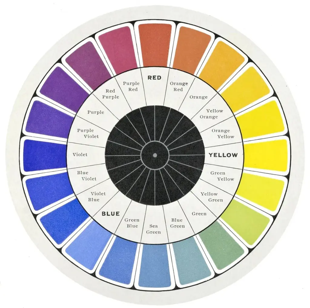
Color harmony is the use of colors that work well together in an image, usually based on their positions on the color wheel. Harmonious schemes such as complementary, analogous and triadic pairings guide the eye, set a mood and make a photo feel balanced, while deliberate contrast gives it energy.
Why It Matters
Color is one of the first things a viewer notices, often before shapes or subjects. Clashing, random colors make a scene feel busy, while a controlled palette feels calm and intentional. Even in documentary work, where you cannot change the scene, you can choose the framing, timing and processing that highlight the strongest color relationships.
Understanding harmony also helps with editing. When you shift white balance, adjust hue sliders or apply a grade, you are changing the relationships among colors, so knowing what works avoids muddy or garish results.
Beginner Color Harmony Basics
Start with the color wheel, a circle that arranges hues in order: red, orange, yellow, green, blue and violet, and blends between them. Colors opposite each other are complementary, and colors next to each other are analogous.
Common Color Schemes
| Scheme | Description | Typical feel |
|---|---|---|
| Complementary | Two colors opposite each other, such as blue and orange | Vibrant and high contrast |
| Analogous | Three neighbors, such as yellow, orange and red | Calm and cohesive |
| Triadic | Three evenly spaced colors, such as red, yellow and blue | Playful and balanced |
| Split complementary | One color and the two neighbors of its opposite | Contrast with less tension |
| Monochromatic | One hue in varying brightness and saturation | Quiet and elegant |
Using The Schemes When Shooting
- Before pressing the shutter, scan the frame for the dominant colors, not just the subject.
- Move a few steps to remove distracting colors or to put a contrasting background behind your subject.
- Look for small accents, such as a red umbrella in a gray street, that draw attention.
- Wait for moving elements, such as a person in a blue coat, to reach a good spot against a complementary background.
- Check the corners of the frame for stray bright colors that pull attention away.
Color Contrast Types
- Hue contrast: very different colors, such as red against green.
- Light and dark contrast: bright colors against dark ones.
- Saturation contrast: vivid colors against muted ones.
- Temperature contrast: warm colors against cool, discussed in warm and cool contrast.
Common Mistakes
- Using every color at full saturation, which makes the image tiring.
- Ignoring the background, where a bright color can compete with the subject.
- Over-editing hues to force a scheme, which creates unnatural skin tones and skies.
- Thinking that harmony means avoiding contrast, when most strong images use both.
A Simple Exercise
Choose one color, such as blue, and spend an hour photographing things with that color and its complement, orange. Notice how a small amount of orange draws attention against a large blue background.
Handy for this: Wide-Angle Zoom Lens — take in the whole scene. (affiliate link)
Advanced Color Psychology, Proportion And Editing For Harmony
The Role Of Proportion
A common guideline is the 60-30-10 rule. Use one dominant color for about 60 percent of the frame, a secondary color for 30 percent, and an accent for 10 percent. This avoids two colors fighting for equal attention. A large blue sky with a small orange boat follows the idea, and the boat becomes the focal point. See visual weight and balance for how color affects balance.
Saturation, Brightness And Meaning
Colors have associations that vary by culture, but some effects are consistent. Warm, saturated colors advance toward the viewer and attract attention, while cool, desaturated colors recede. Light colors feel open and dark colors feel heavy. You can use this to place a subject in front of its background, or to push a distracting object back. Learn more in subject isolation.
Light And Color
The color of light changes the colors you see. Golden hour light adds warmth to everything, and open shade adds blue. These shifts can strengthen a scheme or break it. A white balance change can turn an analogous warm palette into a neutral one. Read color temperature, golden hour photography and blue hour photography to anticipate the effect. Mixed light sources can introduce unwanted casts, covered in mixed lighting color.
Editing For Harmony
In Lightroom, the color mixer and color grading tools let you move hues, adjust saturation and add tints to the shadows, midtones and highlights. A common technique is to push shadows toward a cool hue and highlights toward a warm hue, creating a complementary relationship. To remove distracting colors, reduce the saturation of a single hue. See Lightroom color mixer, Lightroom color grading and color replacement.
Limiting The Palette
Strong images often use a small set of colors. You can reduce a palette by choosing a location, controlling clothing in portraits, or removing distracting items. In editing, reduce saturation in colors you do not want in the scheme. For a more extreme approach, see black and white photography and minimalist photography.
Color And Print Or Screen
Colors look different on screens and prints, and some saturated hues fall outside printable gamuts. Calibrate your monitor and check the result with soft proofing so a harmonious palette remains so in the final output. See monitor calibration and color gamut.
Reading Color In Real Scenes
Real scenes rarely present a clean color wheel, so train yourself to simplify. Squint at the scene, or look at a small preview of the image, and ask which two or three colors dominate. Street scenes often reduce to the color of the buildings, the sky and one accent such as clothing or a vehicle. Natural scenes often reduce to green, blue and one warm accent such as a flower or sunlit rock. Once you see the simple version, framing choices become clear: include the accent, crop out the extra, and let the dominant colors set the mood.
Neutrals And Skin Tones
Grays, whites, blacks and browns act as neutrals that support stronger colors. A scene with lots of neutral tones makes a single bright color stand out. Skin tones sit in the orange range, so blue and teal backgrounds create a natural complement for portraits, which is why this pairing appears so often in film and photography. Keep skin tones believable when you grade, since pushing them too far toward green or magenta looks unhealthy.
Try It
- Take a photo of a scene with a single strong color and list the colors in the frame.
- Move to place a contrasting color behind your subject, and take a second version.
- In editing, shift the shadows cool and highlights warm by a small amount.
- Compare the three images and decide which scheme works best.
Common Questions
What is color harmony in photography?
It is the use of colors that work well together, often based on the color wheel. Complementary, analogous and triadic schemes are common examples that give images a balanced look.
What are complementary colors?
They are colors opposite each other on the color wheel, such as blue and orange or red and green. Together they create strong contrast and make each color look more vivid.
How do I choose colors for a photo?
You usually choose them by choosing a location, time, background and clothing, then fine-tuning in editing. Start with one dominant color and add an accent to guide the eye.
Does color harmony matter for black and white?
Not in the same way, but color still matters because converting changes how tones appear. Different hues turn into different grays, which you can control in the conversion.
Related Lessons
- Warm And Cool Contrast for using temperature to shape mood.
- Visual Weight And Balance to see how color affects the frame.
- Lightroom Color Mixer to shift individual hues.
- Color Temperature to understand how light changes color.
- Subject Isolation for separating subjects with contrast.
Gear That Helps With This
Hand-picked kit that makes this lesson easier to put into practice.
Some links are affiliate links: if you buy through them we may earn a small commission at no extra cost to you. How this works.