
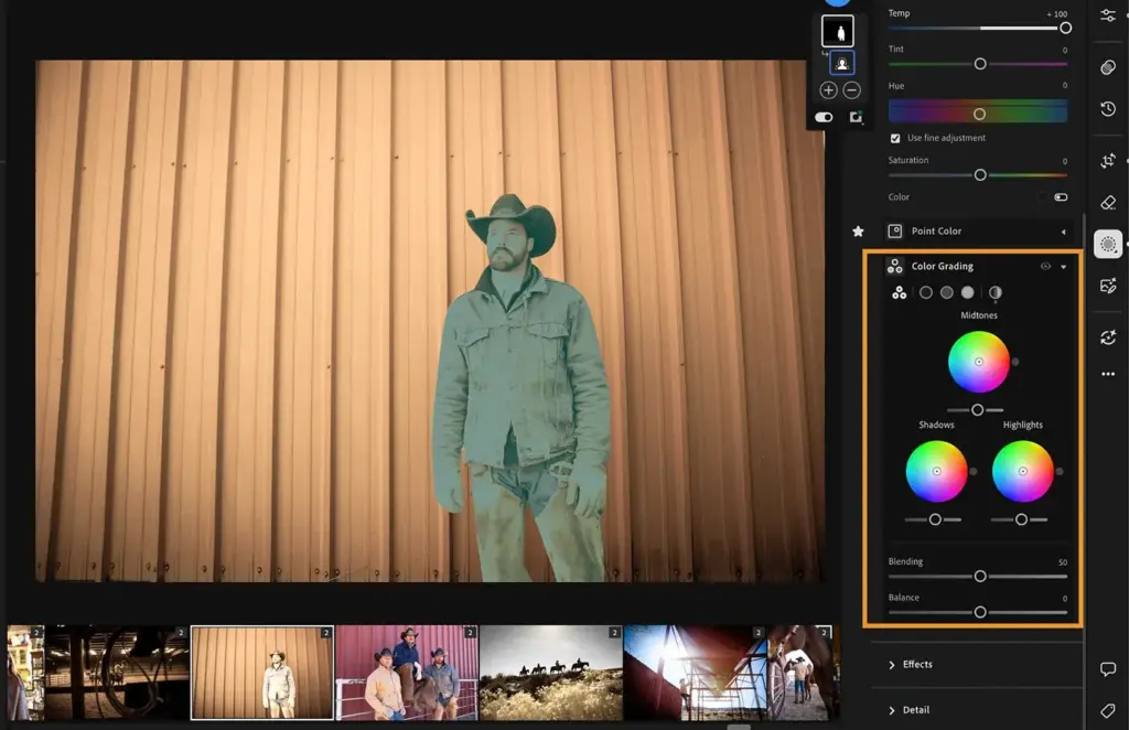
Color grading in Lightroom adds color tints separately to the shadows, midtones and highlights using three color wheels, plus a global wheel and sliders for blending and balance. It creates mood and style, such as warm highlights with cool shadows, without changing the underlying colors the way the color mixer does.
Why It Matters
A well-graded photo has a consistent mood. Warm light and cool shadows suggest a sunset, while greens in shadows and warm highlights give a cinematic feel. Grading is how many photographers build a recognizable style.
The tool replaced split toning with more control. Knowing how each wheel and slider behaves helps you keep changes subtle and avoid skin tones that look wrong.
Beginner Color Grading In Lightroom Basics
Open the Color Grading panel in the Develop module. You will see wheels for Shadows, Midtones and Highlights, plus Global and a combined view. Each wheel has a hue and a saturation control, and a luminance slider below. Drag the dot on a wheel to choose a color, and its distance from the center sets the strength. Blending controls how much the three tonal ranges overlap, and Balance moves the boundary between shadows and highlights.
Controls At A Glance
- Hue sets the color, from 0 to 360 degrees around the wheel.
- Saturation sets the strength of the tint.
- Luminance changes brightness in that tonal range.
- Blending of 50 is the default, and higher values create smoother transitions.
- Balance moves emphasis toward the shadows (negative) or highlights (positive).
Popular Looks And Starting Points
| Look | Shadows | Highlights |
|---|---|---|
| Warm and cool | Blue or teal around 210 | Orange around 40 |
| Cinematic teal and orange | Teal around 190 | Orange around 35 |
| Moody forest | Green around 140 | Warm yellow around 60 |
| Soft pastel | Light pink or lavender | Light peach |
| Vintage faded | Teal with lifted blacks | Warm cream |
A Basic Grade
- Finish exposure, contrast and white balance first, because grading builds on a good base.
- In Shadows, pick a cool hue like blue or teal and raise saturation to about 15 to 25.
- In Highlights, choose a warm hue and set saturation to about 10 to 20.
- Use Blending to smooth the transition and Balance to favor one side.
- Toggle the panel on and off, then lower saturation values if the look feels strong.
Common Mistakes
- Using high saturation values that tint skin and white objects unnaturally.
- Grading before fixing exposure and white balance.
- Applying the same look to every image without checking skin and neutrals.
- Ignoring luminance, which changes tonal contrast as well as color.
A Worked Example
A landscape at dusk looks flat. Add a blue tint to the shadows at hue 220 and saturation 20, and a warm gold to the highlights at hue 45 and saturation 15. Set balance to plus 10 so the warm tone stays in the sky, and reduce blending to keep the colors separate. The image now has depth and warmth that match the light of the scene.
Protecting Skin Tones
Skin sits in the orange and red part of the wheel. A blue tint in the shadows is fine, but heavy colors in midtones affect faces. Use the global wheel sparingly, and check portraits on a neutral background. If skin looks wrong, use a mask to exclude the subject or reduce saturation in the midtone wheel.
Saving And Reusing Looks
Once you like a grade, save it as a preset so you can apply it to similar photographs. Adjust the strength per image, because lighting differs. Keeping a small set of consistent grades produces a cohesive portfolio and speeds up editing.
Checking On Other Screens
Colors can change between devices, so view your graded image on a phone and another monitor. Subtle tints may disappear on some screens, and strong ones may become exaggerated. Aim for a look that holds up in several viewing conditions rather than one perfect display.
Matching A Series
When editing a set of photos from one location, grade one image first, then copy the settings to the others and adjust for each. Light changes during a shoot, so small changes to balance and luminance usually keep the series cohesive. Review the whole set side by side in the grid to confirm that tints look consistent from frame to frame.
Common Starting Mistakes
Beginners often push saturation too far, which makes skies and shadows look artificial. Start with low values, then increase until you first notice the color, and back off slightly. Also watch the neutral objects in the frame, such as white clothing or gray stone, because they reveal tint quickly and show when a grade has gone too far.
Using Luminance Carefully
The luminance slider on each wheel brightens or darkens that tonal range. Lowering shadow luminance deepens blacks and increases contrast, while raising highlight luminance gives a soft glow. Use it with care, since it affects exposure as well as color, and recheck the histogram after large moves to avoid clipping detail.
Handy for this: Monitor Calibrator — colors you can trust. (affiliate link)
Advanced Workflow, Masks And Comparisons
Grading Versus The Color Mixer
The color mixer changes existing colors by range, and grading adds tint by tonal range. Use them together: correct specific colors with the color mixer, and then set mood with grading. Mixing up the tools leads to fighting the image, so decide which problem you are solving first.
Local Color Grading With Masks
Grading can also be applied inside masks, which lets you tint the sky and the foreground differently. See Lightroom masks and gradient filters for building selections. Subtle local grades make images look natural, because real scenes have different color in different places.
Presets, Calibration And Profiles
Presets often rely on grading to build a style, as described in presets. The base color also depends on the camera profile and calibration panel. Select a profile before grading, so the starting colors are predictable.
Black And White Toning
Grading also works on monochrome images, adding a subtle tint to shadows and highlights for a toned print look. See black and white in Lightroom for converting first. A small amount of color adds warmth to otherwise neutral photographs. Related ideas appear in warm and cool contrast and color harmony.
Try It
- Open a landscape or portrait and set exposure and white balance first.
- Add a cool tint to the shadows and a warm tint to the highlights.
- Adjust blending and balance until the transition looks smooth.
- Compare before and after, then lower the saturation until it looks natural.
Common Questions
What is the difference between color grading and the color mixer?
Grading tints the shadows, midtones and highlights, while the mixer changes specific color ranges that already exist in the image.
Does color grading replace split toning?
Yes, it offers the same ideas with an added midtone wheel and more control.
How strong should the effect be?
Usually subtle. Saturation values of about 10 to 25 are common starting points, adjusted by eye.
Can I color grade only part of a photo?
Yes. Use masks to apply color grading to selected areas.
Related Lessons
- Lightroom Color Mixer for targeted color changes.
- Lightroom Masks for local grading.
- Lightroom Presets to save looks.
- Warm Cool Contrast for the idea behind the look.
- Color Harmony to choose colors that work together.
Gear That Helps With This
Hand-picked kit that makes this lesson easier to put into practice.
Some links are affiliate links: if you buy through them we may earn a small commission at no extra cost to you. How this works.