
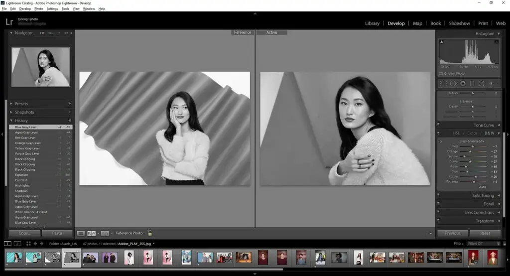
The Lightroom basic panel is the main set of tone and color controls in the Develop module, with sliders for exposure, contrast, highlights, shadows, whites, blacks, texture, clarity, dehaze, vibrance and saturation. Using them in a sensible order lets you set overall brightness first, then shape contrast and recover detail.
Why It Matters
Most photos need only a few adjustments to look right, and nearly all of them happen in the basic panel. Understanding what each slider does, and how they interact, prevents the common problem of pushing everything to the extremes and ending up with a harsh, over-processed image.
It also builds a foundation for every other tool. Curves, masks and color grading all depend on starting with a well balanced base.
Beginner Using The Lightroom Basic Panel Step By Step
Open an image in the Develop module and find the Basic panel at the top of the right-hand column. It begins with white balance, followed by tone and presence controls.
What Each Slider Does
| Slider | Effect |
|---|---|
| Temp and Tint | Shift color from blue to yellow and green to magenta |
| Exposure | Overall brightness, measured in stops |
| Contrast | Separates midtones, making darks darker and lights lighter |
| Highlights | Controls the brightest areas, such as sky |
| Shadows | Controls the dark areas |
| Whites | Sets the white point, the brightest values |
| Blacks | Sets the black point, the darkest values |
| Texture | Fine detail on surfaces |
| Clarity | Midtone contrast, giving a gritty look |
| Dehaze | Removes or adds haze, with strong contrast |
| Vibrance and Saturation | Color intensity |
A Simple Order For Editing
- Fix the white balance so neutral objects look neutral.
- Set exposure so the overall brightness feels right.
- Lower highlights if the sky or bright areas look washed out.
- Raise shadows to reveal detail in dark areas.
- Adjust whites and blacks by holding Alt or Option while dragging to see clipping.
- Add contrast, then fine tune with clarity, texture and vibrance.
Using The Clipping Display
Hold the Alt key on Windows or the Option key on Mac while dragging the whites or blacks slider. The screen shows only the clipped pixels. Move the slider until a few small spots appear for whites, or until the first specks appear for blacks. This sets the full tonal range without losing detail.
Common Mistakes
- Adding too much contrast and clarity together, which creates a crunchy look.
- Pushing shadows too high, which makes the image flat and noisy.
- Ignoring white balance, so every other adjustment fights a color cast.
- Using saturation when vibrance would be gentler on skin tones.
A Five Minute Practice
Take a RAW portrait or landscape and apply the order above without touching other panels. Then compare the before and after view using the backslash key. Most images improve noticeably with only these controls.
Handy for this: Pen Tablet — precise retouching. (affiliate link)
Advanced Slider Interaction, Contrast Control And Working With RAW
Why The Order Matters
Sliders are not independent. Exposure shifts everything, while highlights and shadows affect specific ranges, and contrast pivots around the midtones. If you set contrast before exposure, you may find yourself undoing it later. Think of the process as starting with large, overall changes and finishing with small, local refinements. For the underlying ideas, read the exposure triangle and reading histograms.
Highlights And Shadows Versus Whites And Blacks
Highlights and shadows work on broad tonal regions with a soft fall off, so they are good for recovering detail. Whites and blacks set the endpoints of the tonal scale and act more directly on the extremes. A typical approach is to lower highlights and raise shadows to compress the range, then set whites and blacks to restore full contrast at the ends. See shadow detail recovery and highlight warnings.
Presence Controls In Context
Texture enhances fine detail without affecting broad tones, which suits skin retouching when reduced and rocks or bark when increased. Clarity adds midtone contrast and can introduce halos if overdone. Dehaze can cut atmospheric haze, but also changes color and contrast strongly, so use small amounts. Compare them in texture, clarity and dehaze. Vibrance protects already saturated colors and skin, while saturation affects all colors equally.
Working With RAW And Profiles
RAW files hold more information than JPEGs, so the basic panel can pull back highlights and lift shadows more. Choose a profile first, since Adobe Color, Adobe Neutral and camera matching profiles change the starting contrast and color. Read RAW versus JPEG, camera matching profiles and lens profiles.
When To Move Beyond The Panel
The panel changes the whole image. For selective changes, such as brightening a face or darkening a sky, use masks. For precise tonal control, use the tone curve. For color changes, use the HSL mixer or color grading. See Lightroom masks, the Lightroom tone curve and the color mixer.
Consistency Across A Set
For a series of images from the same shoot, edit one photo carefully, then sync the settings to the others and adjust exposure and white balance individually. Save the result as a preset for later. See syncing settings, Lightroom presets and batch processing.
Checking Your Work
View the image at 100 percent to inspect noise and halos, and at a small size to judge the overall look. Compare against the original frequently. Evaluate on a calibrated monitor, as discussed in monitor calibration.
Worked Example: A Backlit Landscape
Imagine a mountain photo with a bright sky and dark foreground. Start by correcting white balance, then set exposure so the foreground looks natural, which will make the sky bright. Lower highlights by 60 to 80 points to bring back cloud detail, raise shadows by 40 to 60 points to open the foreground, and set whites and blacks with the clipping display. Add a small amount of dehaze for distance and a touch of vibrance. The sky and ground now sit closer together in brightness, and a gradient or mask can finish the job.
Using Auto And Presets As A Starting Point
The Auto button analyzes the image and sets sliders for you. It rarely gives a finished result, but it can show you a reasonable starting point and teach you which sliders matter for a given photo. Treat it like a suggestion, then refine by hand. You can also start from a preset that matches the look you want and adjust exposure and white balance afterward, since presets do not know the lighting of your specific scene.
Common Trouble Spots
Skies that turn gray when highlights are pulled too far can be fixed by reducing the highlight change and adding contrast back with the tone curve. Noisy shadows after a large lift can be improved with the noise reduction in the Detail panel. Muddy skin tones often respond to a small white balance change rather than a saturation tweak. Look at the image after each change and avoid making several large moves at once.
Try It
- Import a RAW photo and choose a base profile.
- Set white balance, then exposure, then reduce highlights and raise shadows.
- Use the Alt or Option key to set whites and blacks while watching for clipping.
- Add a small amount of contrast and vibrance and compare with the original.
Common Questions
What is the basic panel in Lightroom?
It is the main set of tone and color sliders in the Develop module. It covers white balance, exposure, contrast, highlights, shadows, whites, blacks, and presence controls.
What is the difference between highlights and whites?
Highlights affect the bright areas broadly, while whites set the brightest point of the image. Use highlights to recover detail and whites to set the endpoint.
What order should I use the basic sliders?
Start with white balance and exposure, then adjust highlights and shadows, then whites and blacks, then contrast and presence controls. Adjust as needed.
Should I use clarity or texture?
Use texture for fine surface detail and clarity for midtone punch. Use them in small amounts, since both can look harsh when pushed.
Related Lessons
- Reading Histograms to judge exposure objectively.
- Lightroom Tone Curve for precise tonal control.
- Lightroom Masks for selective adjustments.
- Lightroom Presets to save and reuse your edits.
- Texture, Clarity And Dehaze for presence sliders in depth.
Gear That Helps With This
Hand-picked kit that makes this lesson easier to put into practice.
Some links are affiliate links: if you buy through them we may earn a small commission at no extra cost to you. How this works.