
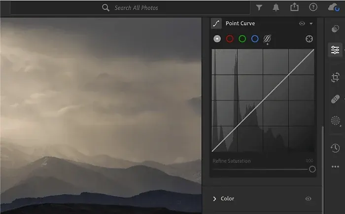
A tone curve is a graph that maps the original brightness of every pixel to a new brightness. The horizontal axis is input, the vertical axis is output, and dragging points on the line lets you change contrast in shadows, midtones and highlights separately, with more precision than the basic contrast slider offers.
Why It Matters
The basic panel sliders move large tonal ranges at once. The tone curve lets you target exactly where contrast is added or removed, so you can deepen blacks without darkening the midtones or soften highlights without flattening the whole picture.
It is also the tool most editors use to make a flat RAW file look finished. A gentle curve shape often does more for punch than any slider, and the same idea appears in Photoshop, video editors and color grading software, so the skill transfers widely.
Beginner How The Tone Curve Works
In Lightroom the tone curve sits in its own panel. The straight diagonal line from bottom left to top right means no change: a pixel that comes in at a given brightness goes out at the same brightness. Bending the line up in an area makes that tonal range brighter, and bending it down makes it darker. The steeper a section of the line, the more contrast that range receives, and the flatter it is, the less.
Reading The Panel
- The bottom left corner is pure black and the top right corner is pure white.
- The lower third of the line controls shadows, the middle third controls midtones and the upper third controls highlights.
- A shape like a lazy letter S adds contrast: shadows go down, highlights go up and the middle gets steeper.
- A line pulled up at the bottom left lifts black to a faded, matte level, a common stylistic choice.
- The histogram behind the curve shows where your tones sit, so you can place points where the data is.
Parametric Curve Versus Point Curve
| Mode | How It Works | Best For |
|---|---|---|
| Parametric curve | Four sliders for Highlights, Lights, Darks and Shadows with draggable region dividers | Quick, safe adjustments that cannot create sudden jumps |
| Point curve | Click the line to add points and drag them freely | Precise shaping and custom looks |
| Targeted adjustment tool | Drag directly on the photo to move the matching curve point | Finding which tone sits where in the image |
| RGB channel curves | Separate red, green and blue lines | Color casts, split toning and film-style color shifts |
| Presets in the point menu | Linear, Medium Contrast and Strong Contrast | A fast starting shape to refine |
A Simple Starting Routine
- Set exposure and white balance first in the basic panel, since the curve works best on a roughly correct image. The lesson on the Lightroom basic panel covers that step.
- Open the point curve and choose Medium Contrast from the menu to see what a gentle S shape does.
- Add a point near the first quarter and pull it down a little, then add one near the third quarter and lift it a little.
- Click Before and After to compare, then reduce the curve until skin, skies and shadows still look natural.
Common Mistakes
- Pushing the S curve too hard, which clips shadow and highlight detail and makes colors look heavy.
- Adding many points and creating wobbles that show up as banding or odd tonal reversals in smooth skies.
- Fixing exposure with the curve instead of the exposure slider, which leaves a flat base image behind.
- Ignoring the histogram, so points land where there are no pixels to affect.
A Worked Example
Take a portrait that looks flat after exposure is set. Add a point at roughly one quarter height and lower it slightly, then add a point at three quarters height and raise it slightly. Skin tones keep their natural look because the midpoint barely moves, while the picture gains depth. If the face now looks too dark, raise the middle of the curve a little instead of undoing the S shape.
Quick Reference
Think of the curve in three questions. Which tones am I changing? In which direction do I bend the line? How steep do I want that section? Answering these before you drag keeps adjustments deliberate. Small moves of a few percent on the grid are normally enough, and you can always compare the result with the original by toggling the panel.
Handy for this: Fast Prime Lens — creamy backgrounds, low light. (affiliate link)
Advanced Curve Mechanics And Advanced Control
Contrast And Saturation Interact
Steepening a curve increases contrast, and in an RGB image it also increases saturation, because each channel is separated further from the others. A strong S curve can therefore push colors toward a neon look even though no saturation slider moved. Lightroom applies the master curve in a way that keeps hue reasonably stable, but heavy curves still change perceived color. Reduce vibrance a little after a strong curve, or use the targeted adjustments described in the color mixer lesson.
Working With The Histogram
Because the histogram sits behind the curve, you can see exactly which part of the range holds the bulk of the data. If most pixels sit in a narrow band in the middle, a steeper section of the curve there will spread them out and add contrast visually. Learn to read the graph with the histogram lesson. When data touches the left or right edge, avoid pushing those ends further, since clipped tones cannot be recovered.
Color Channel Curves
Selecting the red, green or blue channel lets you bend one color across the tonal range. Lifting the blue curve in the shadows and lowering it in the highlights creates cool shadows with warm highlights, a classic cinematic split. Moving the blue end point slightly up from the bottom gives faded film blacks with a cool cast. These moves are subtle, and small changes of a few percent are usually enough. For three-way control by tonal zone, compare with Lightroom color grading.
Curves Versus Other Contrast Tools
The basic panel contrast slider pivots around the middle of the range and applies one overall strength. The tone curve can place the pivot anywhere and shape the roll-off into highlights. Clarity and texture act on local edges rather than global tone, as explained in texture, clarity and dehaze. For the same idea in Photoshop, see curves in Photoshop; Lightroom contrast can also be applied selectively through masks, which use sliders rather than a curve.
Try It
- Open a flat RAW photo, set exposure and white balance, then reset the tone curve to linear.
- Apply the Strong Contrast preset and note which tones change most, then switch to Medium Contrast.
- Create your own S curve with two points, then toggle the panel on and off to compare.
- Lift the left end point slightly to make a matte look, then pull it back until blacks feel natural.
Common Questions
Is the tone curve the same as contrast?
Contrast is one effect a curve can produce. The curve is more flexible because you decide which tones gain contrast and which are left alone.
Should I use the parametric or point curve?
Start with the parametric curve for safe, smooth changes. Use the point curve when you need exact shapes, such as a faded black point or a localized lift.
Why do my colors get stronger when I add contrast?
Steepening the curve separates the color channels, which raises saturation. Lower vibrance or saturation slightly after a strong curve to compensate.
Can I save a curve as a preset?
Yes. Curve settings are part of a develop preset, so a curve you like can be saved and applied to other photos, then adjusted per image.
Related Lessons
- Lightroom Basic Panel for the sliders to set before touching the curve.
- Reading Histograms to place curve points where your pixels actually are.
- Lightroom Color Grading for color shifts by tonal zone.
- Curves In Photoshop for the same tool in layers and masks.
- Lightroom Color Mixer to fine-tune individual colors after the curve.
Gear That Helps With This
Hand-picked kit that makes this lesson easier to put into practice.
Some links are affiliate links: if you buy through them we may earn a small commission at no extra cost to you. How this works.